Artists wish more social media platforms would look into the issue of their art being stolen, misattributed, or outright uncredited.
Different types of artists want to feel like they belong to a community rather than trying hard to fit in
to existing mainstream socials.
Artists find it's difficult to share and promote art without spending lots of time on social media marketing.
Art enthusiasts find it hard to discover the kind of art they like, new artists they might like, and new media that would interest them.
According to surveys conducted by the author. Sampled self-identifying artists and art-enthusiasts between the ages of 18 and 64
As an artist, I want to take control of my art on the internet and find people interested in my pieces, so I can build a community and profit from my work.
As an art enthusiast, I want to find and discover new art, creators, and communities, so I can lead a more fulfilling life.
With my research in mind, I decided creating a holistic and inclusive social network and platform for artists was the best way to address these problems. The question then was... how?
• Create a welcoming and intuitive space / interface for artists and art enthusiasts
• Provide powerful tools for artists to showcase their
art and protect their intellectual property
• Make the platform approachable for amateur/professional and digital/traditional media artists
• Create an effective marketplace for artists
• Prevent users from feeling overwhelmed by
the breadth of available content
• Combine digital and real-world art worlds, so art lovers can transition from visiting a gallery to discussing the art online
I wanted to first brainstorm some broad ideas for the product, as a prelude to making concrete solutions. These were some of the results:
• The solution needs to emphasize the artist when showing content to the user, making accreditation more obvious
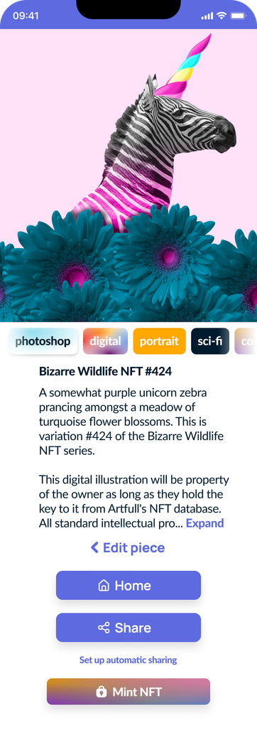
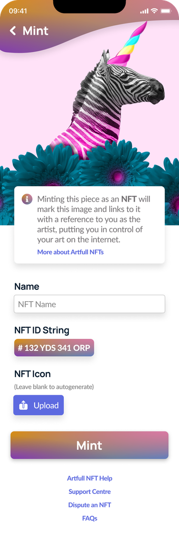
• Minting art as NFTs would be a powerful tool for artists to take control of their
intellectual property as it exists on Artfull and on other platforms
• A broad offering of community-oriented features (catering to multiple skill levels) helps to address issues of belonging, impostor syndrome, etc.
• Foster organic social media presence growth for artists with featured
artists and art in each categories, multiple useful filters and emphasis on content discovery
New solutions need to learn from existing ones.
The existing major online art platforms seek to address some of the problems faced by artists, but have some major weaknesses. I chose to analyze two of them - ArtStation, and DeviantArt. These are well-known networks for artists; comparing their plusses and minuses would help build a better solution.

Features
• Caters to digital artists
• Lets artists make portfolios
• Connected to employers, particularly in the video game and entertainment industries
• Has a marketplace for selling art and prints
• Comes with advanced tools for artists
• Offers lessons and courses
• Job boards, connections to schools, challenges, guides, magazine
Disadvantages
• Almost exclusive focus on digital, and particularly game art
• Professional-oriented, discourages more casual/less experienced artists
• Obvious paid vs. free membership feature discrepancies

Features
• Community for amateurs and professionals
• Technically supports traditional and digital media
• Supports commissions, prints
• Premium galleries for followers
• Groups and forums
Disadvantages
• No centralized marketplace, transactions only take place privately between artist and commissioner
• Amateur-oriented
• Little onboarding beyond signup
• Site pages feel disconnected
• Design system clashes between main and child pages
To solve these problems, this was the product proposal:
Built for professionals and amateur artists alike, the product accommodates artists who work with traditional physical media as well as digital artists.
Tailored experiences for artists, art lovers, curators, and more make the product a unique experience for each user.
Share your art through posts and subcommunities. Monetize it through both commissions and central marketplaces, then safeguard it by minting it as an NFT.
Create galleries of your favourite art and artists, easily share with friends and take advantage of scheduled events, groups, and livestreams.
Taking advantage of user research, I crafted personas as an aid for further fleshing out the solution.
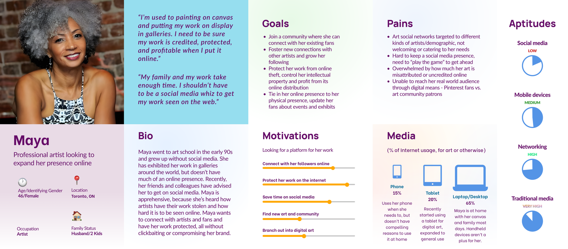
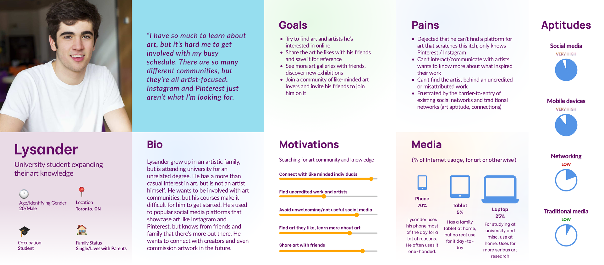
Building off of these personas, I sketched out what the solution might look like on paper, gave it a name, and made a rough outline of its logo and style.
Design Decisions
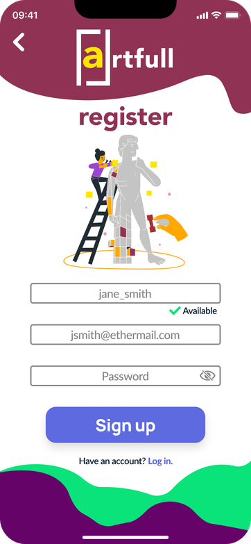
The frame around the 'a' represents the ever-present constraints that artists face in an online medium - sharing their art within the confines of a virtual frame, as traditional painters do.
The wordplay combines artful ("clever, showing skill or taste") with the product being "full of art", a concept which is aspirational to Artfull's goal of being a unifying platform for all kinds of art appreciators.
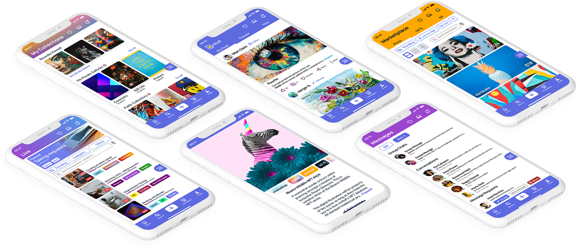
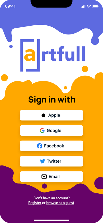
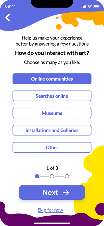
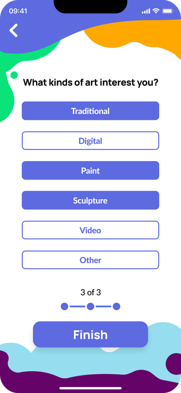
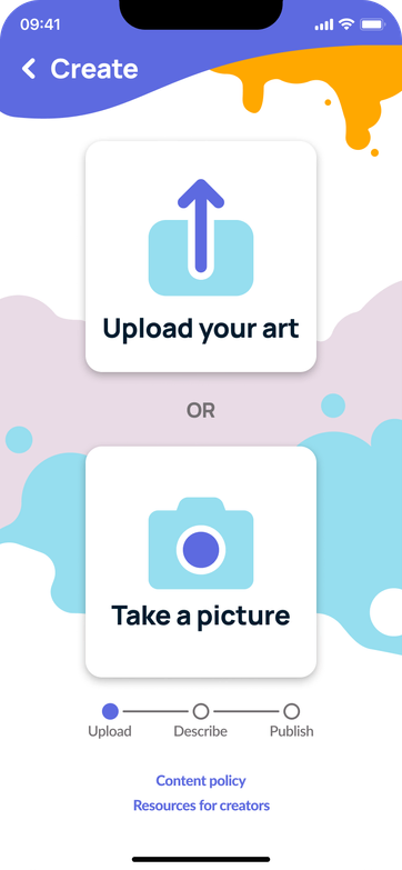
I wanted to include paint splotches in non-critical areas of the screen, to give Artfull a unique look. I wanted to keep these features to a select number of screens (mostly onboarding and loading), so normal navigation and use would not be impeded.
Sketching and Wireframes
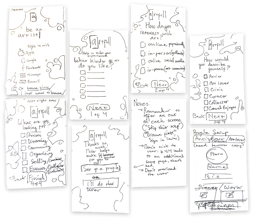
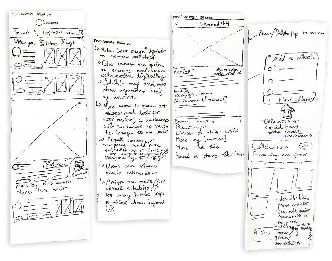
I made quick and rough sketches so that I could later translate my ideas into a digital format (i.e. Figma prototypes).
These sketches show an onboarding process, in order to make a unique and tailored experience for the user,
as well as a main page and a short "Add to collection" flow.
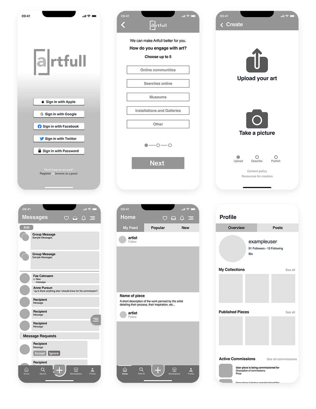
Using my design ideas and sketches, I created digital wireframes and a low fidelity prototype; I used the latter to conduct usability and A/B testing.
Findings
• Users preferred a more playful, painterly style
• Some pages felt stark and uninteresting. This is something of a pitfall when using colorless lo-fi for usability testing, and users often remark upon it even if it isn't being tested for.
• The top icons are too close together
• An embedded create (+) icon won out over the version in the lo-fi prototype.
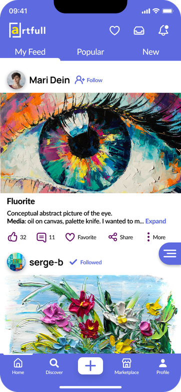
• A hamburger menu located near the bottom won out over one located at the top.
• As an app focused on art, users thought it should be aesthetically pleasing; participants mentioned words like "playful", "enjoyable", "colorful".
Conclusions
User testing shaped my view of how users should interact with the app and helped me think of new methods to show content to users in a way that would engage them.
The mobile app for Artfull is meant to be about spontaneity and community. What does that mean?
As a rule, mobile visits to sites are less involved than desktop ones. There are fewer opportunities for users to complete complex tasks on mobile. Therefore, art creation will most often take the form of simple uploads or picture-taking.
• Activity (posts from other users)
• Collections (user favorites, albums, curated pieces)
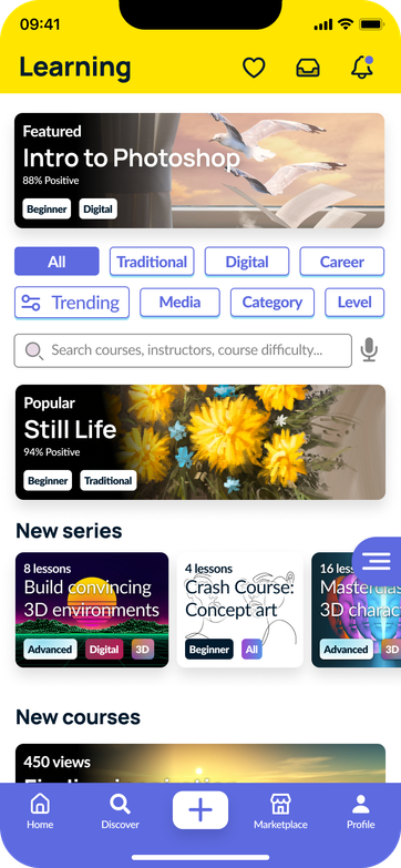
• Learning (lessons from other users, certified professionals, courses)
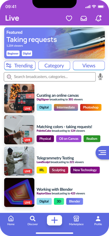
• Livestreaming (live work and art from other users - start livestreaming)
• Commissions (keep track of works you're commissioning, or as an artist, your own commissions)
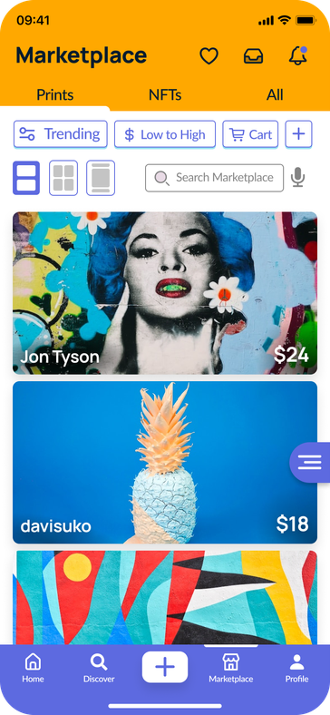
• Marketplace (sell and buy art, working with NFTs or prints)
• Discover (Find anything; art, groups, artists, etc. - includes algorithm and manual search)
• Artists (See popular and rising artists, chosen by Artfull or by peers, emphasis placed on new artists)
• Events (Exhibitions, virtual and real life, meetups, etc.)
• Groups (Community forums and outlets for interaction - groups for niche artforms)
Given the breadth of Artfull's value proposition, there needs to be a way to organize all this content effectively and easily for the user to navigate between without a second thought.
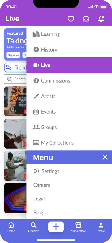
The floating menu
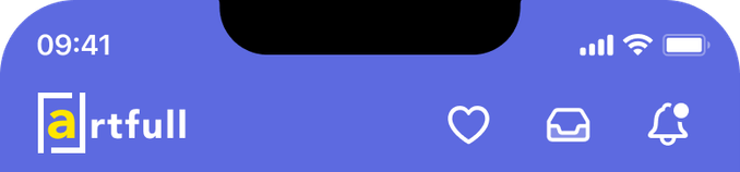
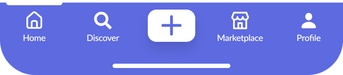
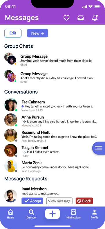
There are three key components to Artfull's navigation. The top bar, the bottom navigation, and the hamburger menu.
Colour
With a foundation of black, white, and blue, I wanted to include more colour; specifically, ones that would be associated with specific sections (being careful to maintain text and image contrast). The aim is to reduce mental load on the user and increase navigational speed by using color and contrast instead of relying on language.
Positioning
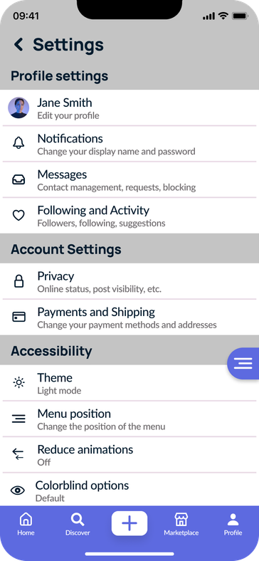
Because the menu is so important to the user experience, having it in the top right or left corner (in one of the so-called "dead zones" for touch interactions), was undesirable. Instead, I placed the menu on it's own near the bottom right of the screen, in easy reach of a left or right thumb.
THANK YOU FOR READING